
How To: working with color
Color plays a vital role in setting the tone for a space. It influences the mood, boosts personality, and contributes to functionality. In this blog post I’ll dive into color theory in the simplest of terms, and then I’ll share some ideas for gathering color inspiration and how to apply them in your home.
Color Theory, Simplified
Color theory is the study of how colors interact and affect human perception and emotions. It is based on hue, value, and saturation. The image below depicts the difference between the three.
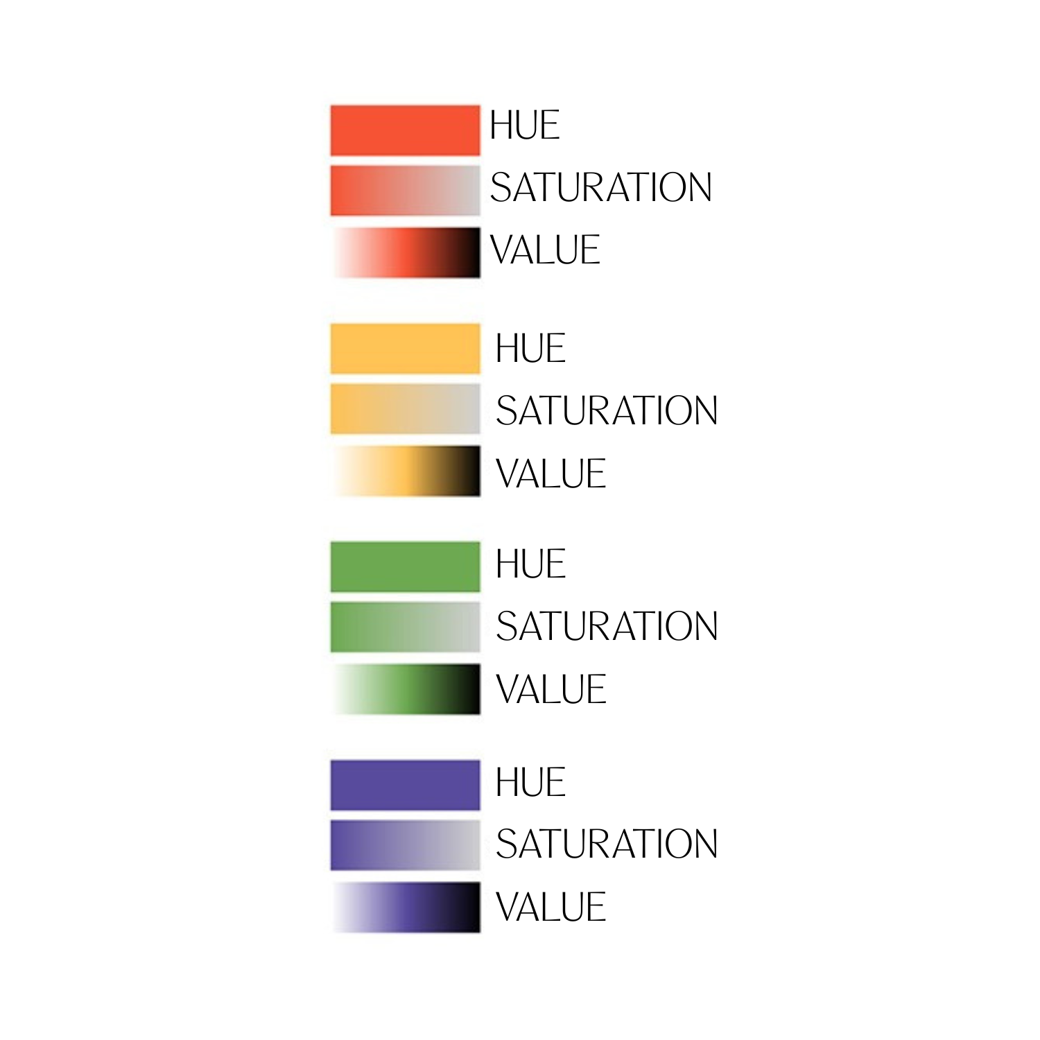
Hue, Saturation, and Value
Hue: You can think of Hue as the base color. Red, for example.
Saturation: A color's saturation describes the intensity of a hue. Highly saturated colors appear bright and vibrant, while desaturated colors appear gray.
Value: The lightness or darkness of a color is its value. A color can have different values by adding white or black to it. Value is usually represented on a gradient, with white being the lightest value and black being the darkest value.
Primary, Secondary, and Tertiary Colors
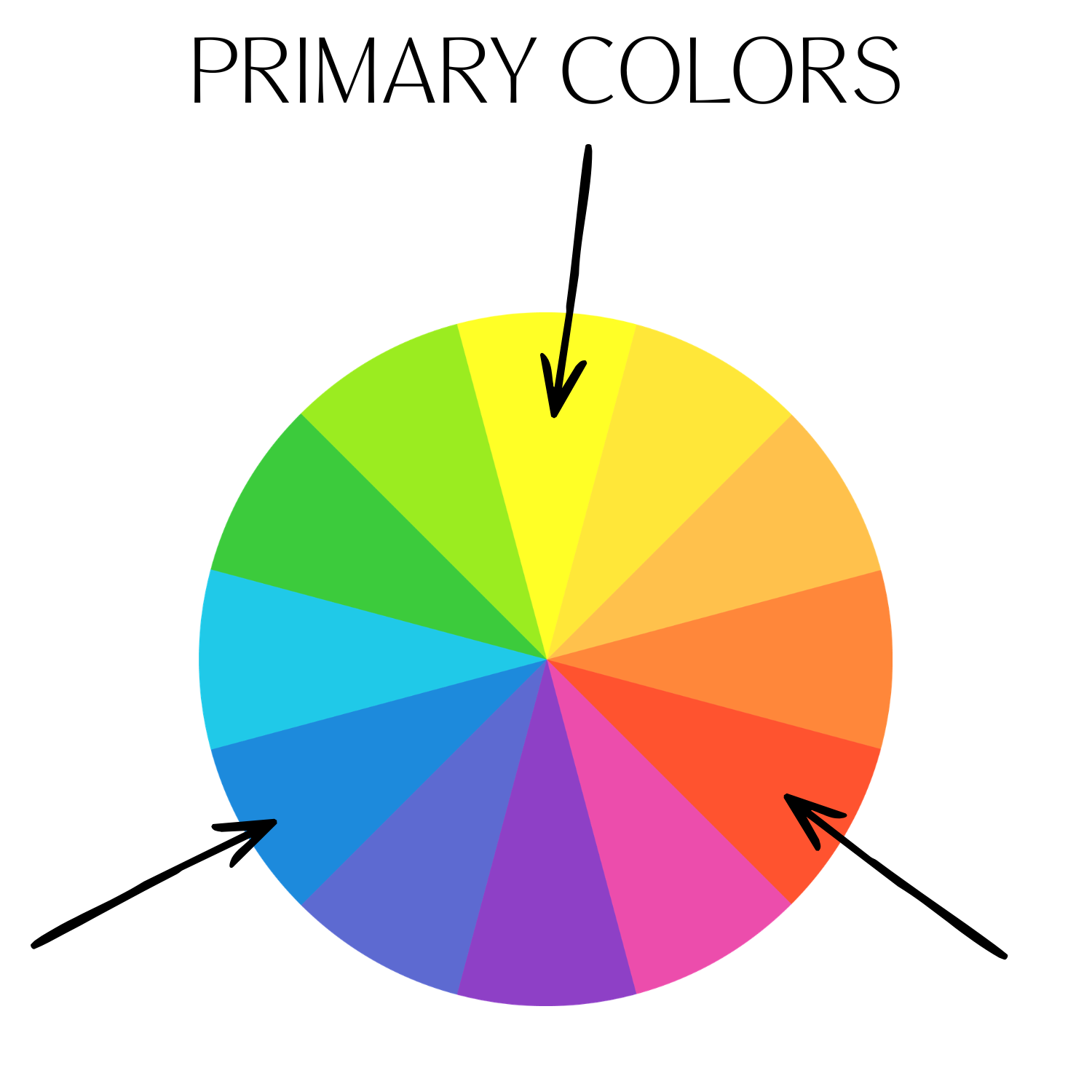
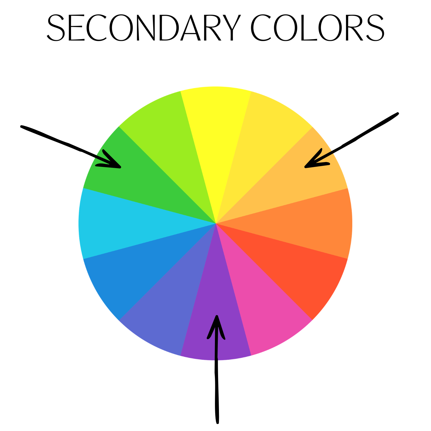
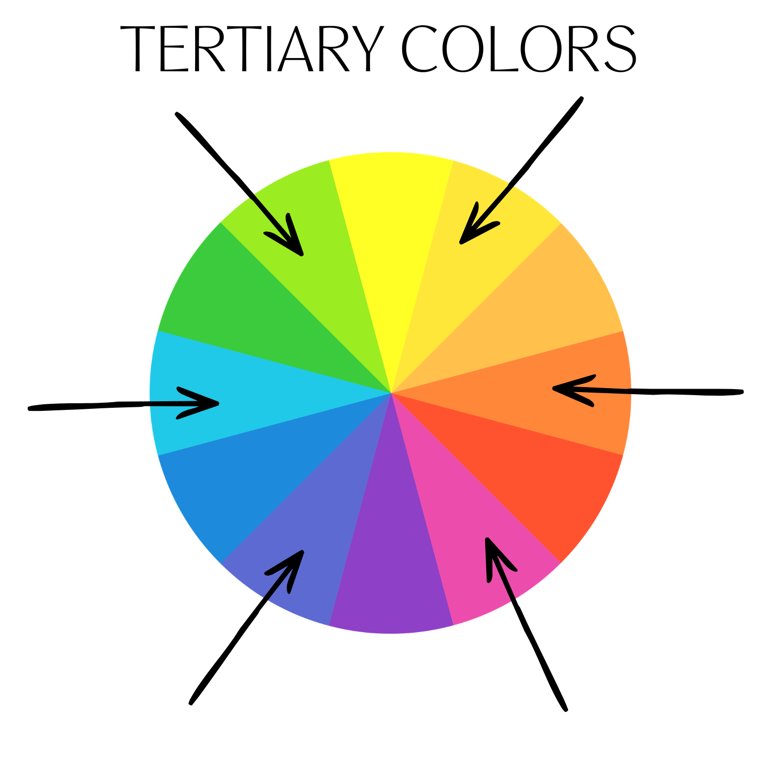
Red, yellow, and blue are the primary colors from which all other colors begin. Orange, green, and purple are secondary colors made by combining primary colors. Yellow-orange, red-orange, red-purple, blue-purple, blue-green, and yellow-green are tertiary colors that are made by combining a primary and a secondary color. Primary, secondary, and tertiary colors are all considered hues.
Color Psychology
Color can bring on a sense of adventure and excitement, or create an atmosphere of calm and comfort. Color is also cultural. Groups of people attach specific meanings, emotions, and traditions to hues based on history, religion, and environment. While biology provides the capacity to see color, culture interprets it. For example, white represents purity and weddings in Western cultures, but symbolizes mourning and funerals in many Asian cultures.
With the above in mind, here are some general associations of color within culture in North America.
Red: Energy, passion, excitement, intensity. I love using red as an accent color
Orange: Invigorating, vibrant, energetic, enthusiastic, creative
Yellow: Joyful, energetic, optimistic, welcoming, cheerful. It’s no secret I LOOOOOOVE a yellow kitchen.
Green: Soothing, refreshing, relaxing, calming. Who doesn’t love green?
Blue: Calmness, tranquility, serenity, peacefulness, relaxation
Purple: Creativity, spirituality, luxury, sophistication, regality. Purple is probably the color I use least in my designs, which makes sense because I prefer a casual vibe.
Brown: Stoic, strong, reliable, heavy
Black: Mysterious, elegant, serious, powerful, sophisticated. Every room needs a little bit of black IMO.
Gray: Neutrality, simplicity, calmness
White: Purity, simplicity, minimalism
Determining a Color Scheme
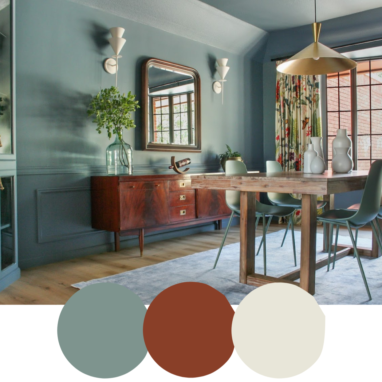
There are several different ways you can determine your color palette for a room. One easy way to create a color palette is to follow the 60/30/10 rule: 60% of your space is one dominant color, 30% is a supporting character, and 10% is an accent color. You don’t literally have to calculate it, but it allows you to think of the room as a whole. Pick your 60% first and then see what coordinating colors work well with it.
Another way of determining your color palette is by looking to the color wheel. Here are a few examples of ways you could use a color wheel to find your color palette:
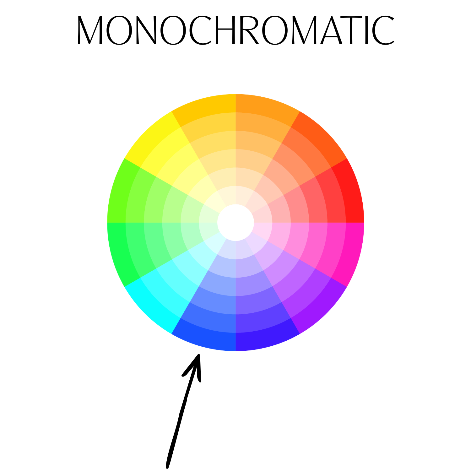
Monochromatic: After choosing a base color, you can use different shades, tints, and tones of that color to create a monochromatic palette.
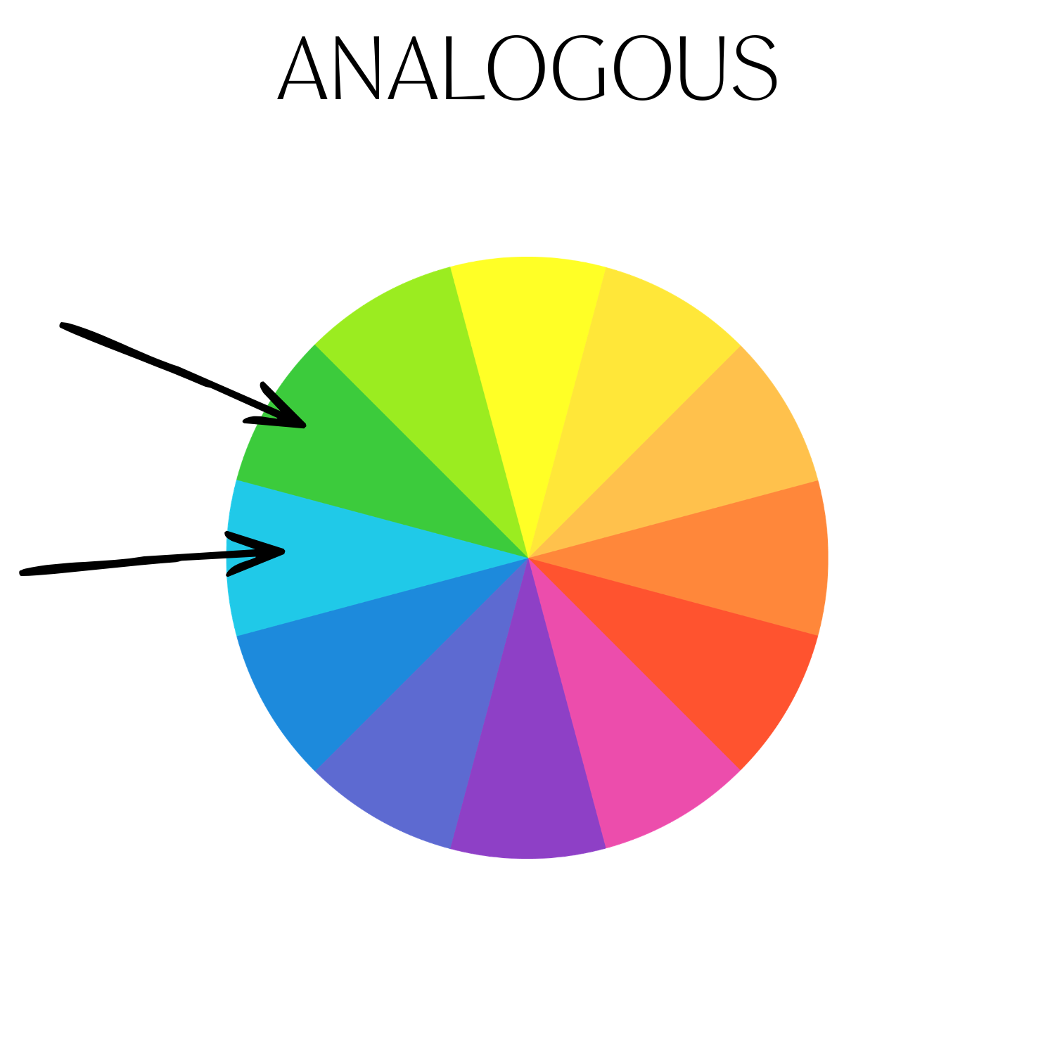
Analogous: This color scheme involves two colors that are next to each other on the color wheel.
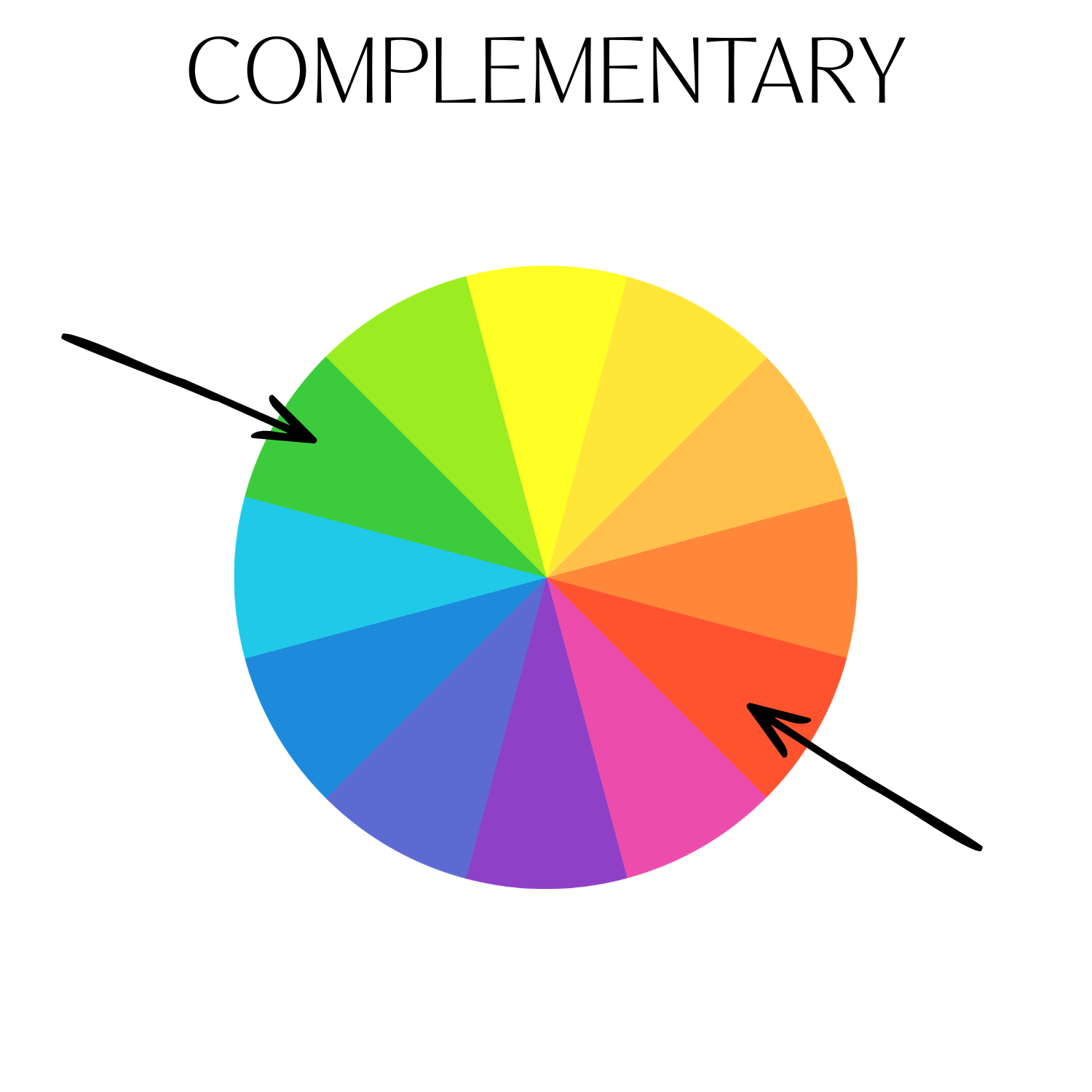
Complementary: This uses two colors that are opposite each other on the color wheel. Blue and orange or red and green are two examples of complementary color schemes.
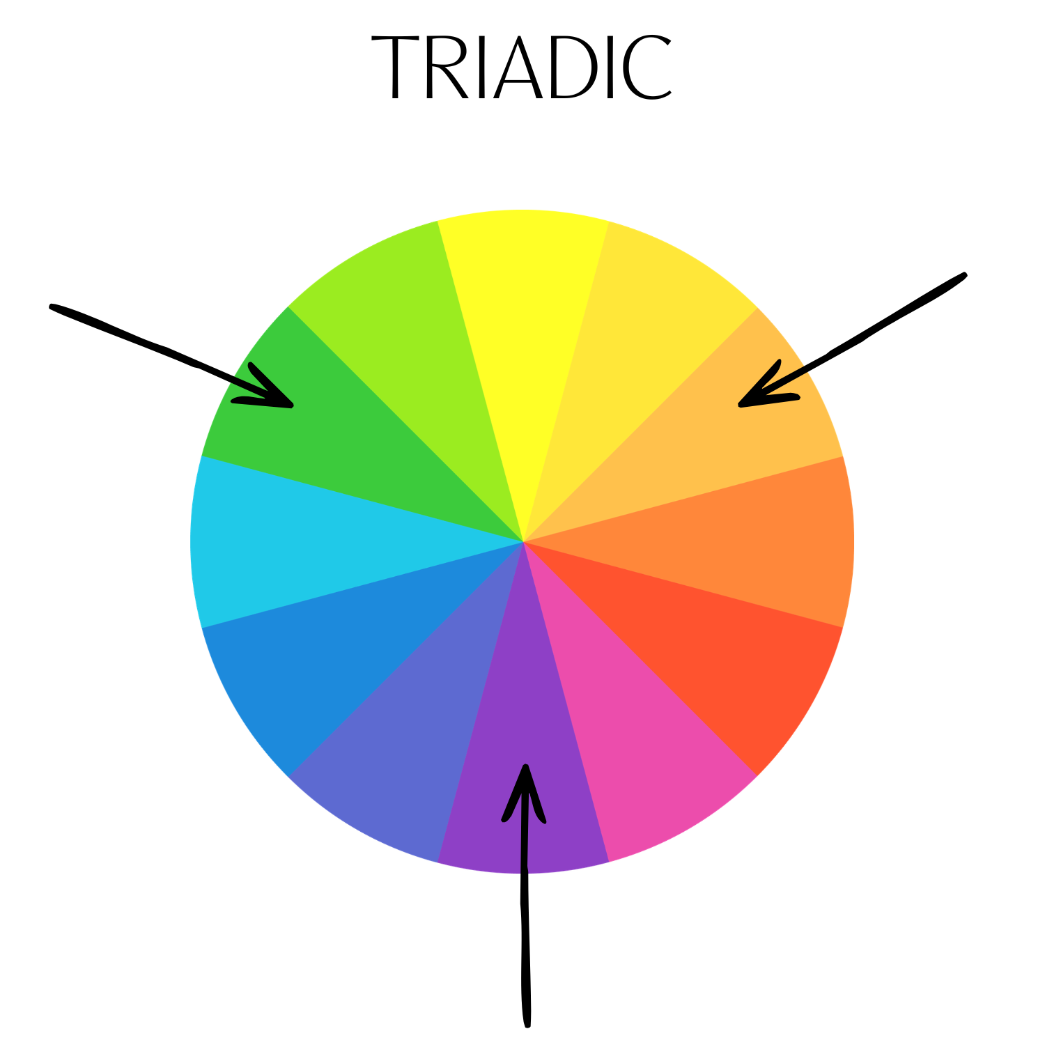
Triadic: Three colors that are evenly spaced on the color wheel combine to create a triadic color scheme. One example is red, yellow, and blue. Another is purple, green, and orange.
Another way I like to create color palettes is by looking to nature. I’ve got a story highlight on my Instagram page called “ColorPalettes” and it’s 100% color ideas inspired by nature.
There are so many other ways to determine a color palette: pulling colors from a wallpaper or rug (I do this often), studying branding colors, or borrowing from an art piece you love.
Choosing Paint Colors
If you’ve looked at paint strips from a paint store, you know that most paint swatches have gradients from the same color family on them. Pro tip when picking grays: while your preferred color may appear to be a clean gray, it likely has undertones of another color in it. Look at the darkest color on the paint swatch to determine the color family you're working with. If the darkest color looks purple, it has purple undertones. If you'd like something with green undertones, then you’ll know it’s time to find another strip to pull from.

It's important to view the paint in the space you're working in. Lighting in a hardware store, in someone else’s home, or a different room within your own home can be very different from the lighting in the space you’re working in. Once you've narrowed down your color choices, buy samples of your selected colors and paint them on a board or cardstock which you can move around and see in different lighting throughout the day. I prefer this over painting directly onto walls, because samples may be a different sheen than what you’ll be painting the room with later. For example, let’s say you’re painting your room with a matte paint, but the paint sample you purchased is eggshell. Sometimes you can see inconsistencies where you painted the eggshell sample underneath the final matte finish.
Companies now offer 8x10 samples with adhesive backings that can be applied to the wall and easily peeled off. These adhesive samples may not be available in every color offered at places like Sherwin-Williams. They tend to only carry their most popular colors. You can also look at companies like Samplize who carry paint samples in multiple brands.
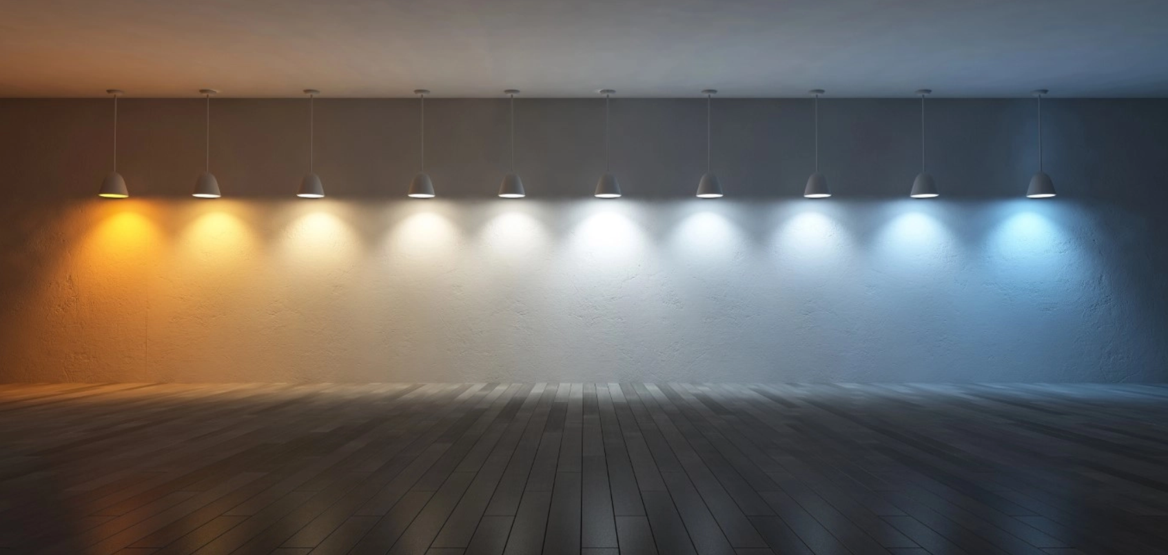
You might be surprised to see how much a color can change at various times of the day, depending on available natural and artificial light sources in the room. Be sure to check your walls throughout the day to determine your final paint color. What might look one color with only natural light pouring in during daytime looks very different at night with only artificial lighting in the space. See the image below depicting the impact of lighting temperature on paint colors.
if all else fails….
I got your back and I’d be happy to help you. Click the button below to get some help with your home.
If you found this helpful, please share with a friend! Questions about color? Drop them in a comment below!